


Transforming
Ambassador, Safeer 2.0
The Complexity Behind the Curtain
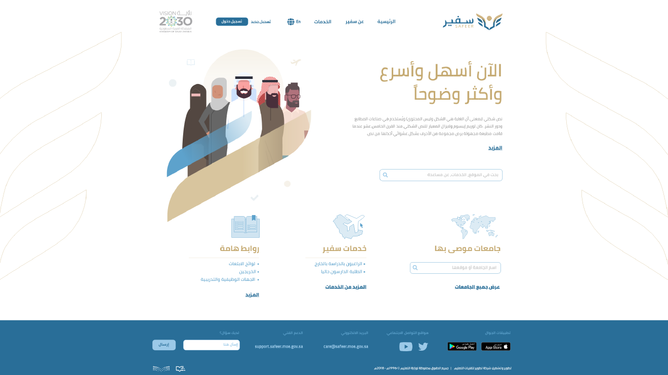
Imagine you're a Saudi student abroad, managing your scholarship, dealing with international paperwork, and trying to access the services you need through a government portal that feels more like a maze than a helping hand. That was the reality for thousands using the Safeer2 platform.
When I joined the project, Safeer2 was critical to managing Saudi Arabia’s overseas scholarship program. It was used by students, academic attachés, ministry officials, and support staff. But despite its importance, the experience was frustrating: complex forms, unclear processes, and a total lack of transparency. My mission was clear: simplify the experience, bring clarity to the chaos, and design a service that empowered students rather than confused them.
Listening First, Designing Later
Before jumping into wireframes, I needed to understand what was broken.
I spoke with:
- Students feeling overwhelmed by the system
- Attachés dealing with repetitive back-and-forths
- Support teams drowning in requests that could’ve been self-served
From these conversations, one truth emerged: the platform wasn’t designed around user journeys. It was designed around government processes.
Top user pain points:
- No idea where their requests stood
- No guidance on what to submit or how
- Redundant and fragmented service flows
It wasn’t just a usability issue it was an emotional one. Students felt lost and unsupported.
Shifting the Mindset From Forms to Flows
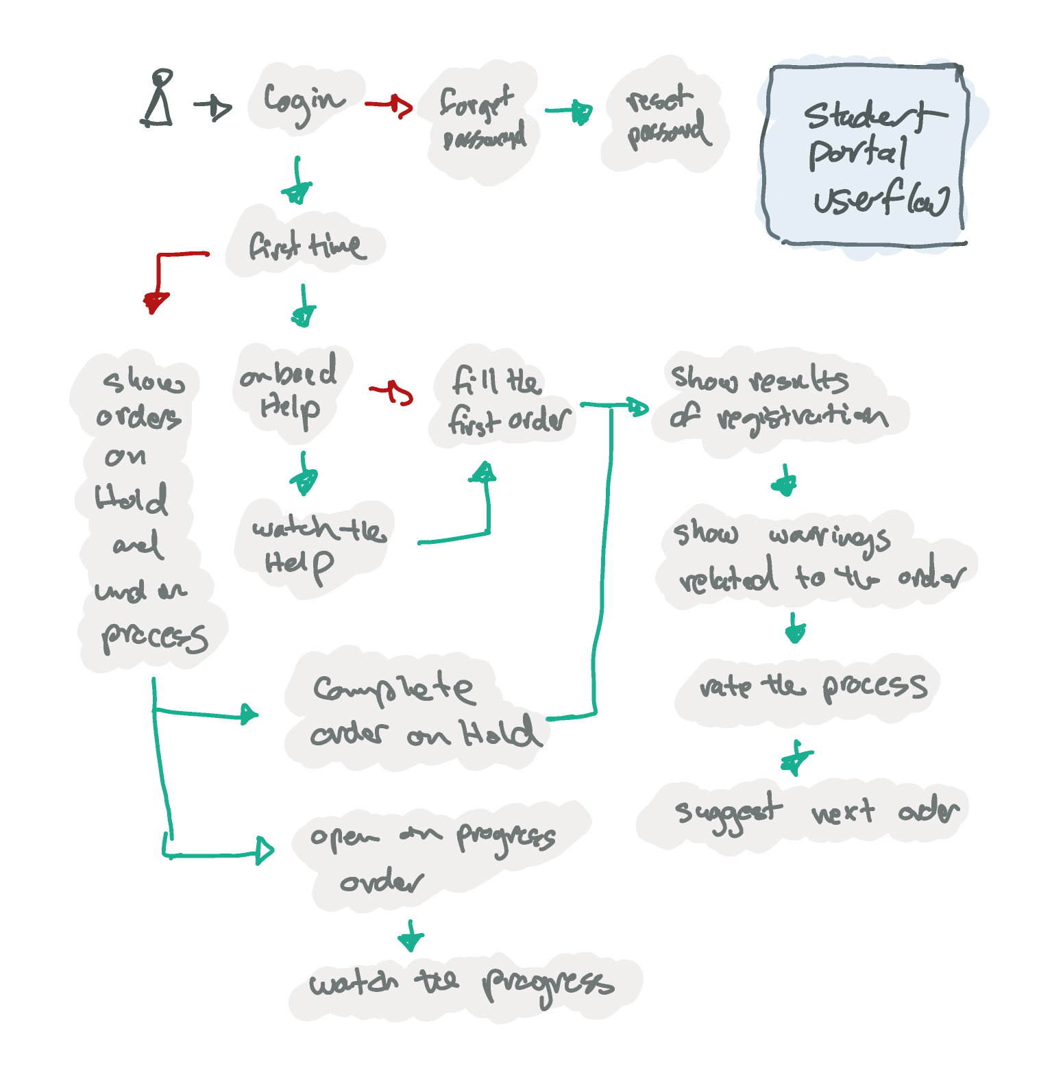
We didn’t just want to improve the UI. We wanted to rethink how the platform worked. That meant:
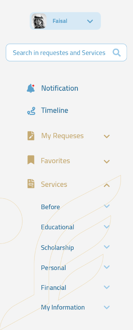
- Reorganizing services by student journeys:Instead of bureaucratic categories, we grouped services by life moments: starting a scholarship, transferring universities, requesting a leave, etc.
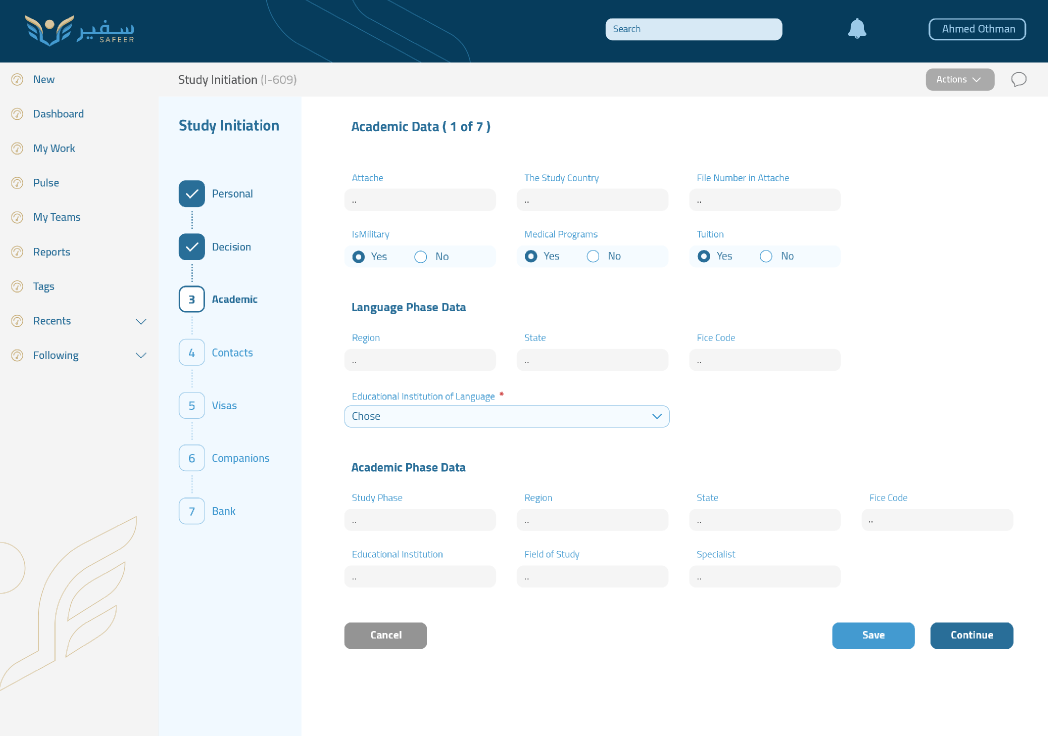
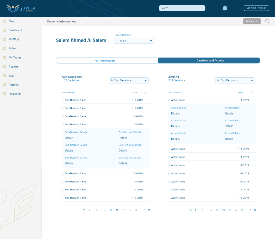
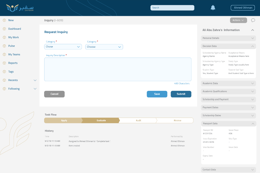
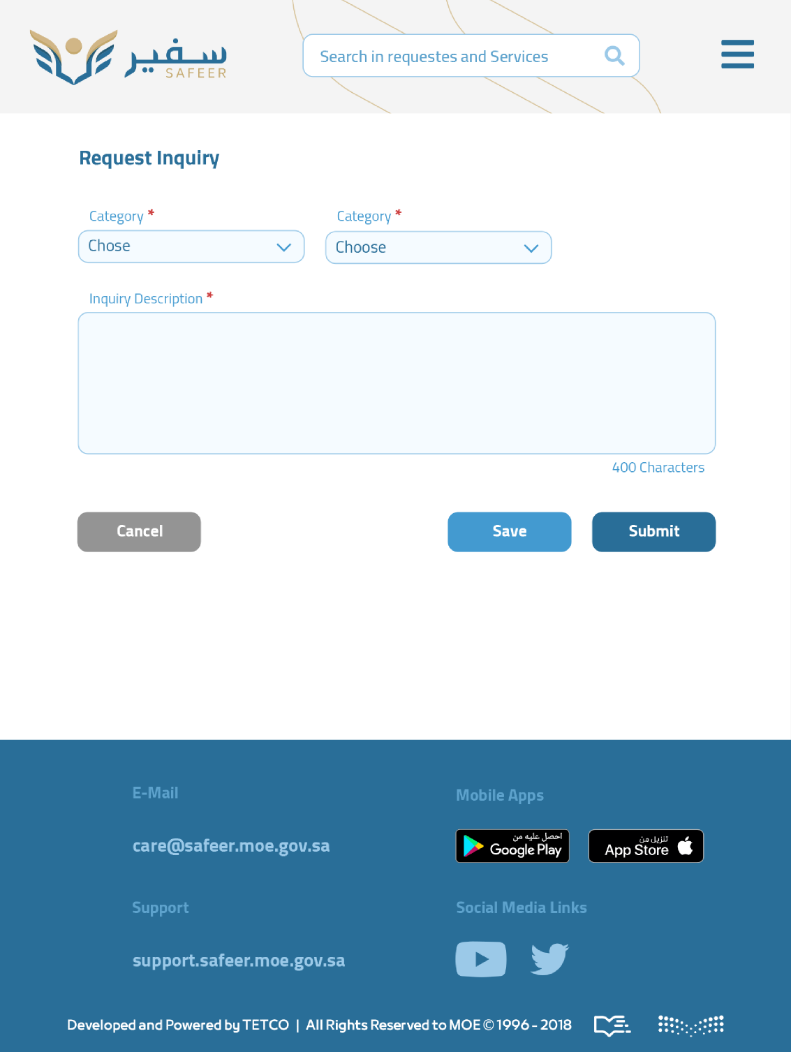
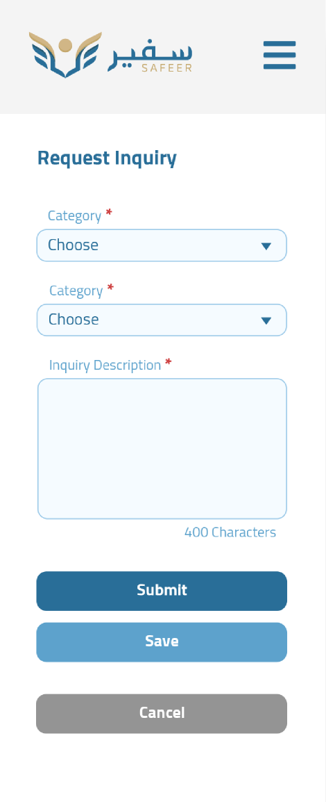
- Designing guided, dynamic flows:We built step-by-step wizards with smart validations and contextual tips that only showed relevant fields based on a student’s profile.
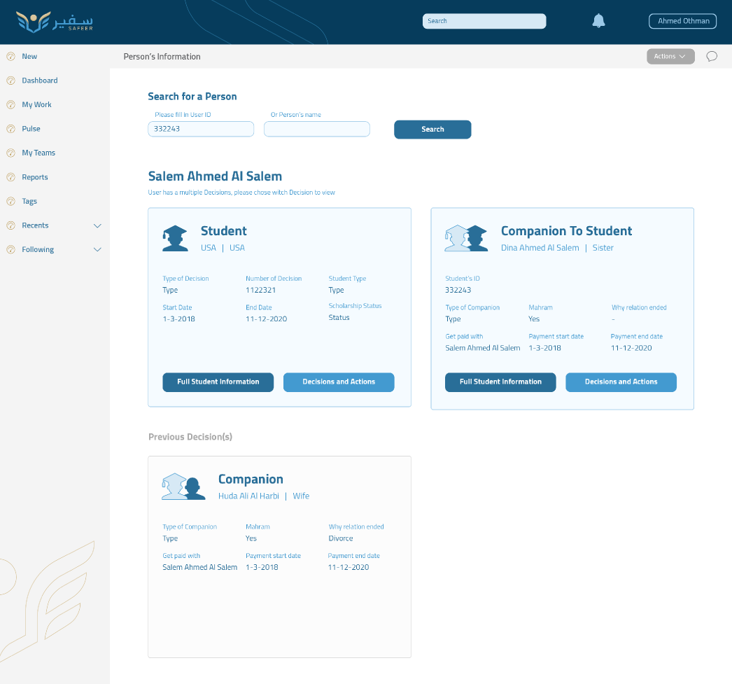
- Creating a sense of progress and transparency:Requests now had clear statuses, reviewers, and estimated response times—all visible to the student.
- Building dashboards for attachés:We gave academic staff visibility and control over what matters most: what’s pending, urgent, or waiting on them.
Every design choice was rooted in empathy and real-world behavior.
Testing Assumptions in the Real World
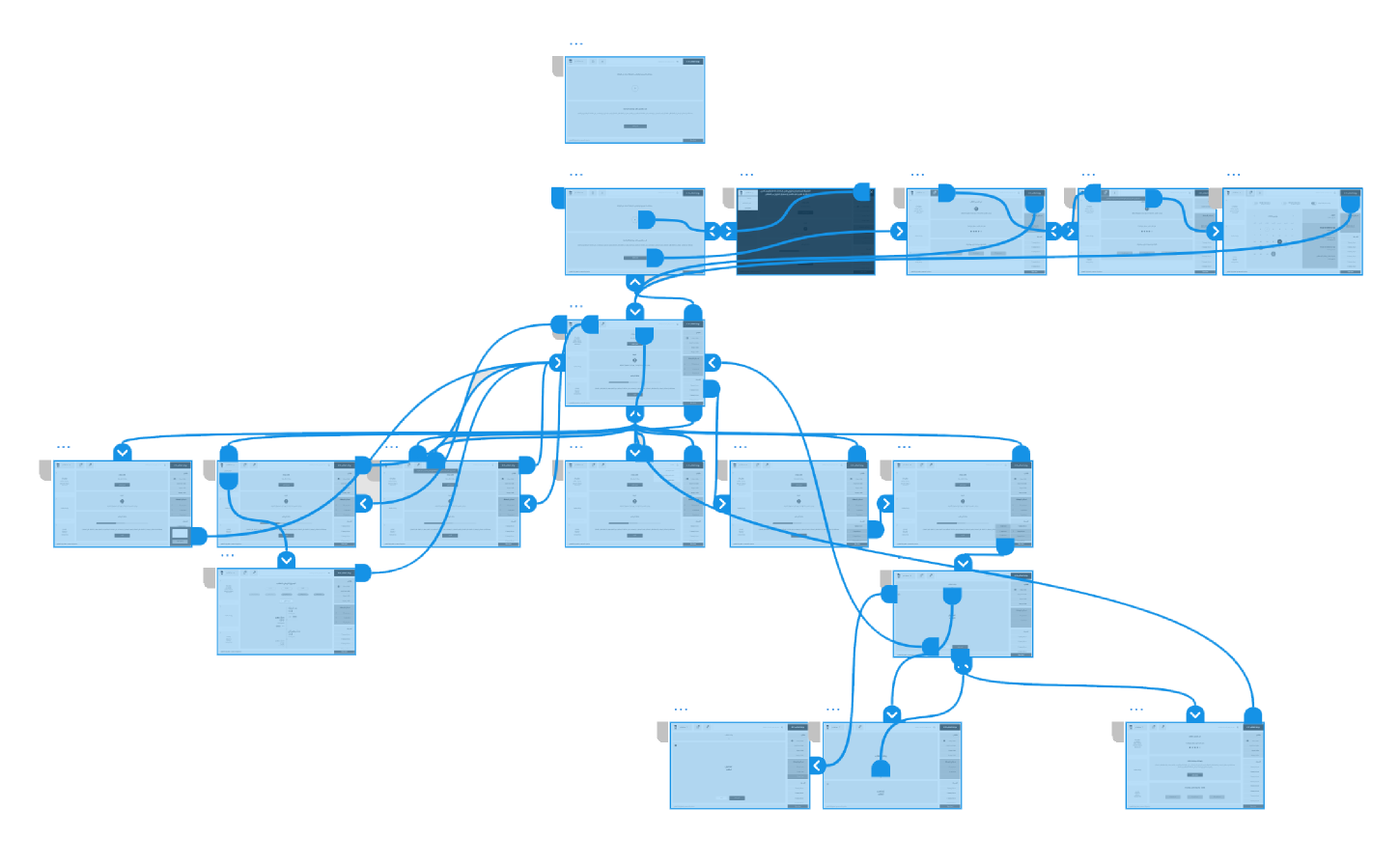
With prototypes in hand, we moved quickly to test with students and attachés across various countries.
We learned:
- Students responded best to progress-based flows (like tax software or visa applications)
- Attachés wanted smart alerts and summaries, not just data dumps
- Support calls dropped when status messages included time estimates
Each round of feedback brought us closer to a product that felt human, not just functional.
Visual Design
Where Form Meets Function
What Changed
- We turned an overwhelming portal into a purposeful platform. Here’s what we achieved:
- 60% increase in successful self-service submissions
- 35% decrease in support tickets
- 45% faster average time from submission to decisionStudents felt more confident. Attachés felt more in control. And the ministry had a scalable, sustainable platform that finally reflected the future of digital government services.
Other Showcases

Designing The Telehealth solution, Klnk
© 2025 All rights reserved
Home
Visual Snapshots
Contact
Transforming
Ambassador, Safeer 2.0
The Complexity Behind the Curtain
Imagine you're a Saudi student abroad, managing your scholarship, dealing with international paperwork, and trying to access the services you need through a government portal that feels more like a maze than a helping hand. That was the reality for thousands using the Safeer2 platform.
When I joined the project, Safeer2 was critical to managing Saudi Arabia’s overseas scholarship program. It was used by students, academic attachés, ministry officials, and support staff. But despite its importance, the experience was frustrating: complex forms, unclear processes, and a total lack of transparency. My mission was clear: simplify the experience, bring clarity to the chaos, and design a service that empowered students rather than confused them.
Listening First, Designing Later
Before jumping into wireframes, I needed to understand what was broken.
I spoke with:
- Students feeling overwhelmed by the system
- Attachés dealing with repetitive back-and-forths
- Support teams drowning in requests that could’ve been self-served
From these conversations, one truth emerged: the platform wasn’t designed around user journeys. It was designed around government processes.
Top user pain points:
- No idea where their requests stood
- No guidance on what to submit or how
- Redundant and fragmented service flows
It wasn’t just a usability issue it was an emotional one. Students felt lost and unsupported.
Shifting the Mindset From Forms to Flows
We didn’t just want to improve the UI. We wanted to rethink how the platform worked. That meant:
- Reorganizing services by student journeys:Instead of bureaucratic categories, we grouped services by life moments: starting a scholarship, transferring universities, requesting a leave, etc.
- Designing guided, dynamic flows:We built step-by-step wizards with smart validations and contextual tips that only showed relevant fields based on a student’s profile.
- Creating a sense of progress and transparency:Requests now had clear statuses, reviewers, and estimated response times—all visible to the student.
- Building dashboards for attachés:We gave academic staff visibility and control over what matters most: what’s pending, urgent, or waiting on them.
Every design choice was rooted in empathy and real-world behavior.
Testing Assumptions in the Real World
With prototypes in hand, we moved quickly to test with students and attachés across various countries.
We learned:
- Students responded best to progress-based flows (like tax software or visa applications)
- Attachés wanted smart alerts and summaries, not just data dumps
- Support calls dropped when status messages included time estimates
Each round of feedback brought us closer to a product that felt human, not just functional.
Visual Design
Where Form Meets Function
What Changed
- We turned an overwhelming portal into a purposeful platform. Here’s what we achieved:
- 60% increase in successful self-service submissions
- 35% decrease in support tickets
- 45% faster average time from submission to decisionStudents felt more confident. Attachés felt more in control. And the ministry had a scalable, sustainable platform that finally reflected the future of digital government services.
Other Showcases

Designing The Telehealth solution, Klnk
Home
Visual Snapshots
Contact
© 2025 All rights reserved
Home
Visual Snapshots
Contact
Transforming
Ambassador, Safeer 2.0
The Complexity Behind the Curtain
Imagine you're a Saudi student abroad, managing your scholarship, dealing with international paperwork, and trying to access the services you need through a government portal that feels more like a maze than a helping hand. That was the reality for thousands using the Safeer2 platform.
When I joined the project, Safeer2 was critical to managing Saudi Arabia’s overseas scholarship program. It was used by students, academic attachés, ministry officials, and support staff. But despite its importance, the experience was frustrating: complex forms, unclear processes, and a total lack of transparency. My mission was clear: simplify the experience, bring clarity to the chaos, and design a service that empowered students rather than confused them.
Listening First, Designing Later
Before jumping into wireframes, I needed to understand what was broken.
I spoke with:
- Students feeling overwhelmed by the system
- Attachés dealing with repetitive back-and-forths
- Support teams drowning in requests that could’ve been self-served
From these conversations, one truth emerged: the platform wasn’t designed around user journeys. It was designed around government processes.
Top user pain points:
- No idea where their requests stood
- No guidance on what to submit or how
- Redundant and fragmented service flows
It wasn’t just a usability issue it was an emotional one. Students felt lost and unsupported.
Shifting the Mindset From Forms to Flows
We didn’t just want to improve the UI. We wanted to rethink how the platform worked. That meant:
- Reorganizing services by student journeys:Instead of bureaucratic categories, we grouped services by life moments: starting a scholarship, transferring universities, requesting a leave, etc.
- Designing guided, dynamic flows:We built step-by-step wizards with smart validations and contextual tips that only showed relevant fields based on a student’s profile.
- Creating a sense of progress and transparency:Requests now had clear statuses, reviewers, and estimated response times—all visible to the student.
- Building dashboards for attachés:We gave academic staff visibility and control over what matters most: what’s pending, urgent, or waiting on them.
Every design choice was rooted in empathy and real-world behavior.
Testing Assumptions in the Real World
With prototypes in hand, we moved quickly to test with students and attachés across various countries.
We learned:
- Students responded best to progress-based flows (like tax software or visa applications)
- Attachés wanted smart alerts and summaries, not just data dumps
- Support calls dropped when status messages included time estimates
Each round of feedback brought us closer to a product that felt human, not just functional.
Visual Design
Where Form Meets Function
What Changed
We turned an overwhelming portal into a purposeful platform. Here’s what we achieved:
- 60% increase in successful self-service submissions
- 35% decrease in support tickets
- 45% faster average time from submission to decisionStudents felt more confident. Attachés felt more in control. And the ministry had a scalable, sustainable platform that finally reflected the future of digital government services.
Other Showcases
Designing The Telehealth solution, Klnk
Home
Visual Snapshots
Contact
© 2025 All rights reserved