Explore the Future of Investing, Smart Advisory

The Challenge
Bringing Guidance and Trust to Investing
When I first started exploring the investing landscape, I noticed how intimidating most digital experiences felt. Apps were either overloaded with financial jargon or too eager to upsell, leaving users anxious rather than informed. I wanted to design an experience that helps people invest confidently, one that feels intelligent yet approachable, trustworthy yet empowering.
That vision became Smart Advisory, a Robo-Advisory experience designed to make smart investing feel effortless.
Competitive Insights
What I Learned From the Field
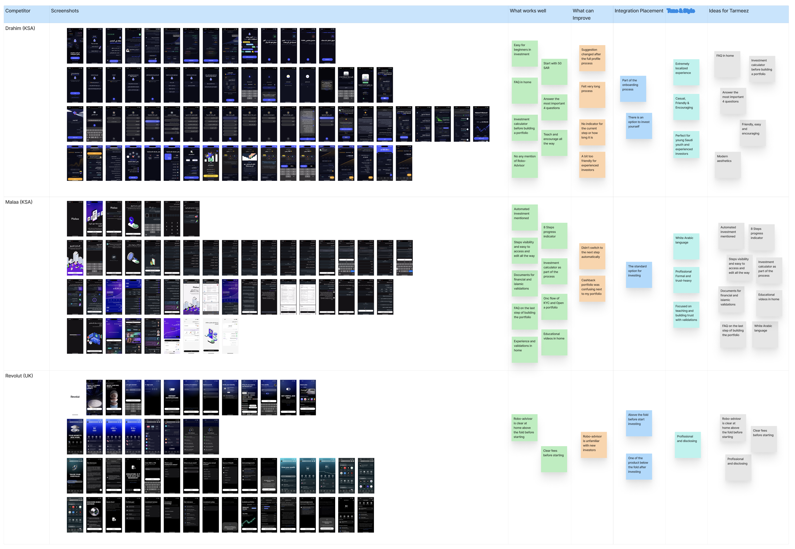
To ground my approach, I benchmarked three successful financial apps: Malaa, Drahim, and Revolut.
Across these products, I discovered patterns that shaped the foundation of Smart Advisory: smooth onboarding, simple risk profiling, and concise summaries that reduced cognitive load.
But I also noticed recurring friction points: confusing terminology, pushy upselling, and unclear exit paths. These observations guided my focus on clarity, calm guidance, and giving users full control over their investment journey.
Jobs To Be Done & Design Principles
The Real Jobs Our Users Are Hiring Us For
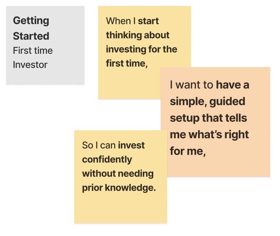

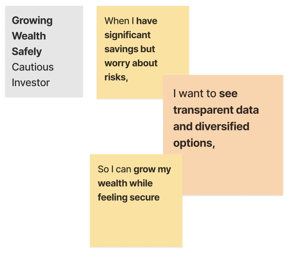
Through user research and scenario mapping, I distilled three core motivations behind why people turn to a robo-advisor:
- “I’m new to investing. I want simple, confident guidance.”
- “I don’t have time. I need quick, trustworthy recommendations.”
- “I’m cautious with risk. I want transparency and control.”
These became the foundation for my guiding principles:
- Subtle Intelligence (advice that helps without intruding)
- Trust by Design (transparency through tone, data, and behavior)
- Effortless Flow (familiar, low-friction interactions)
User Flow Overview
A Journey From Curiosity to Confidence
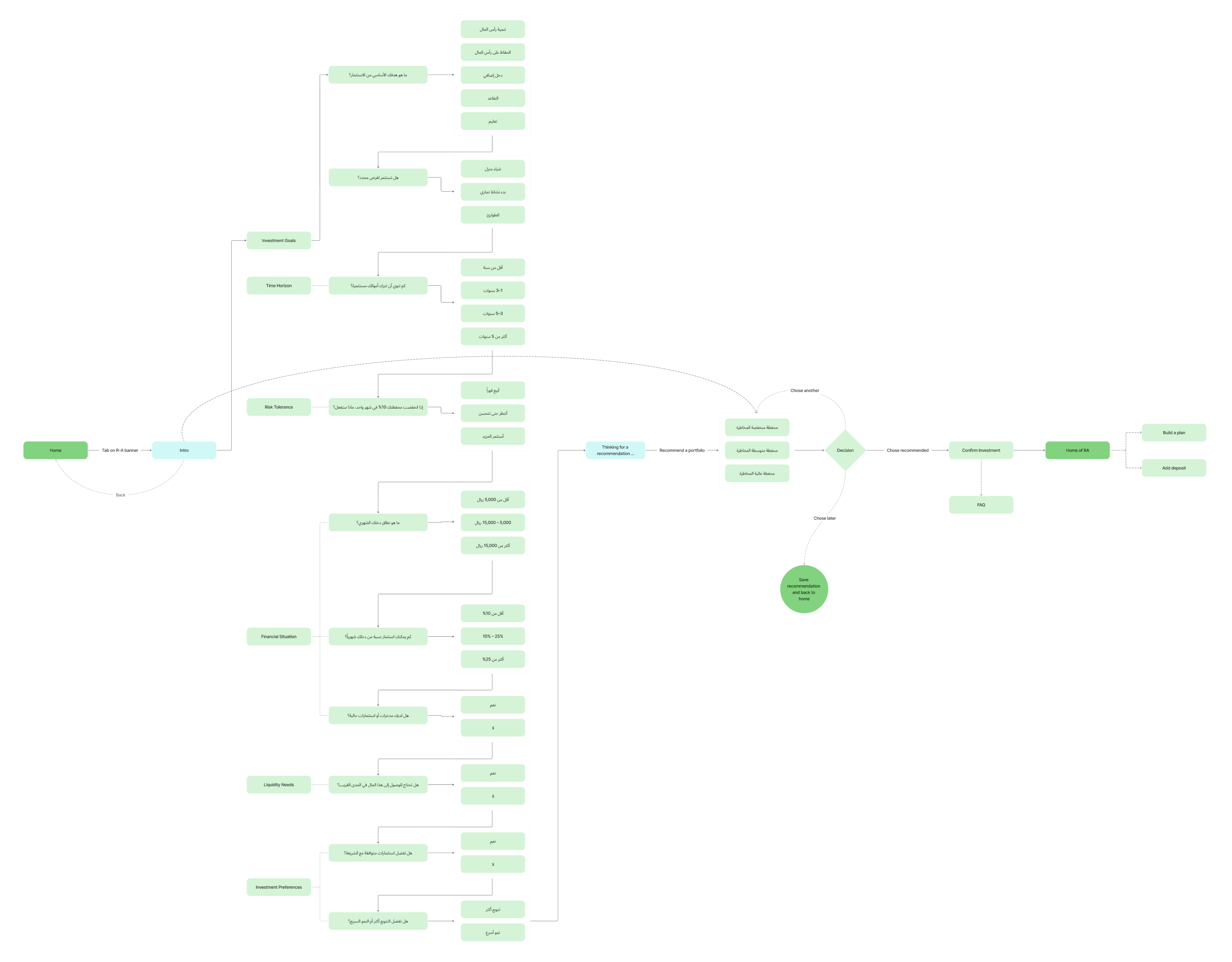
The user journey in Smart Advisory was designed to feel natural, structured, and emotionally grounded, guiding users from initial curiosity about investing to the confidence of building and managing their own plans. Each flow builds on the previous one, gradually increasing the user’s sense of understanding, trust, and control.
An Icon that Tells a Story
A Symbol Rooted in Growth, Trust, and Culture
I wanted Smart Advisory to have a visual identity that reflects both intelligence and local culture.
At its heart, the emblem’s negative space forms a subtle sparkle, a nod to guidance and AI insight. Surrounding it, leaf-like shapes represent growth, prosperity, and financial wellness.
The geometry draws inspiration from Islamic art, balancing modernity with cultural familiarity. The result is a symbol that feels human and trustworthy, just like the experience it represents.
Risk Profiling
Curiosity turning into calm confidence

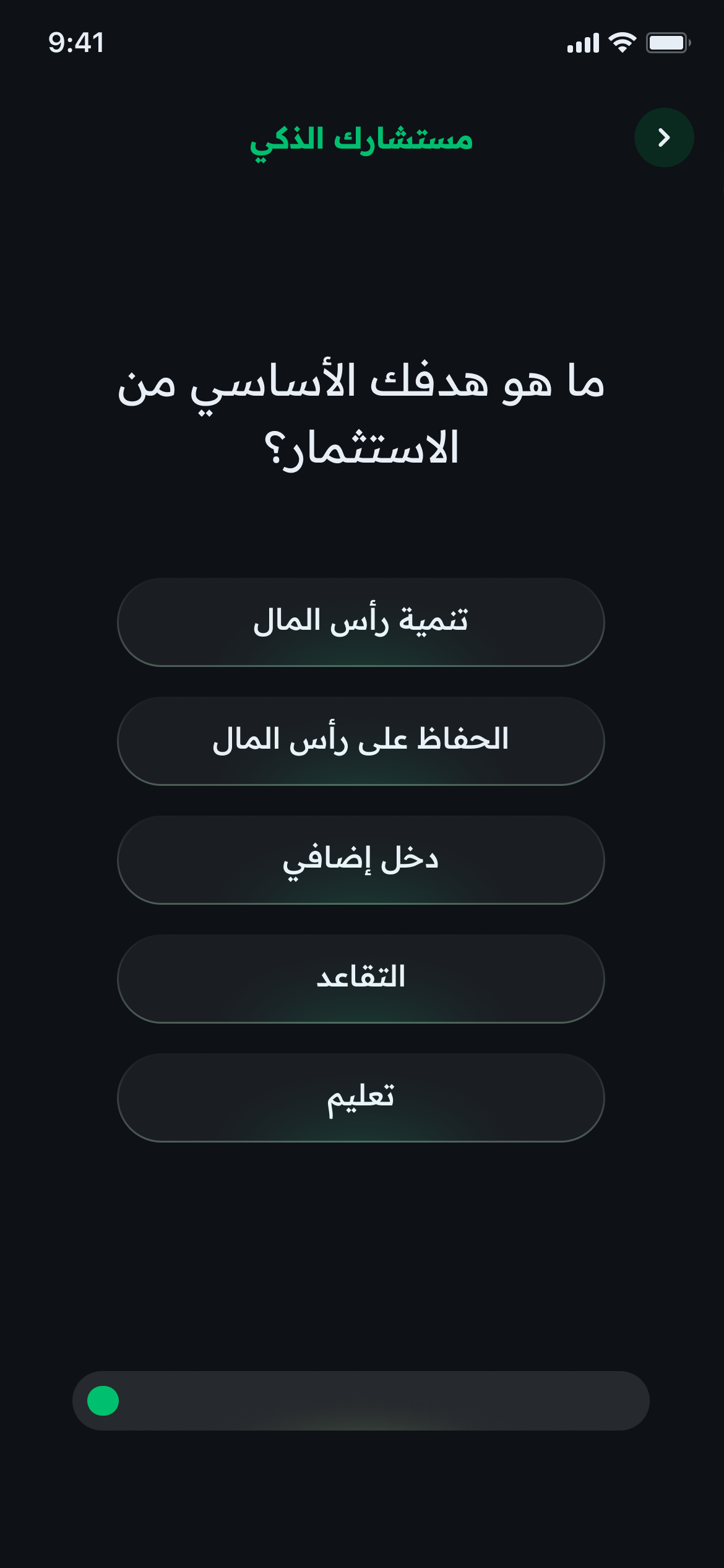
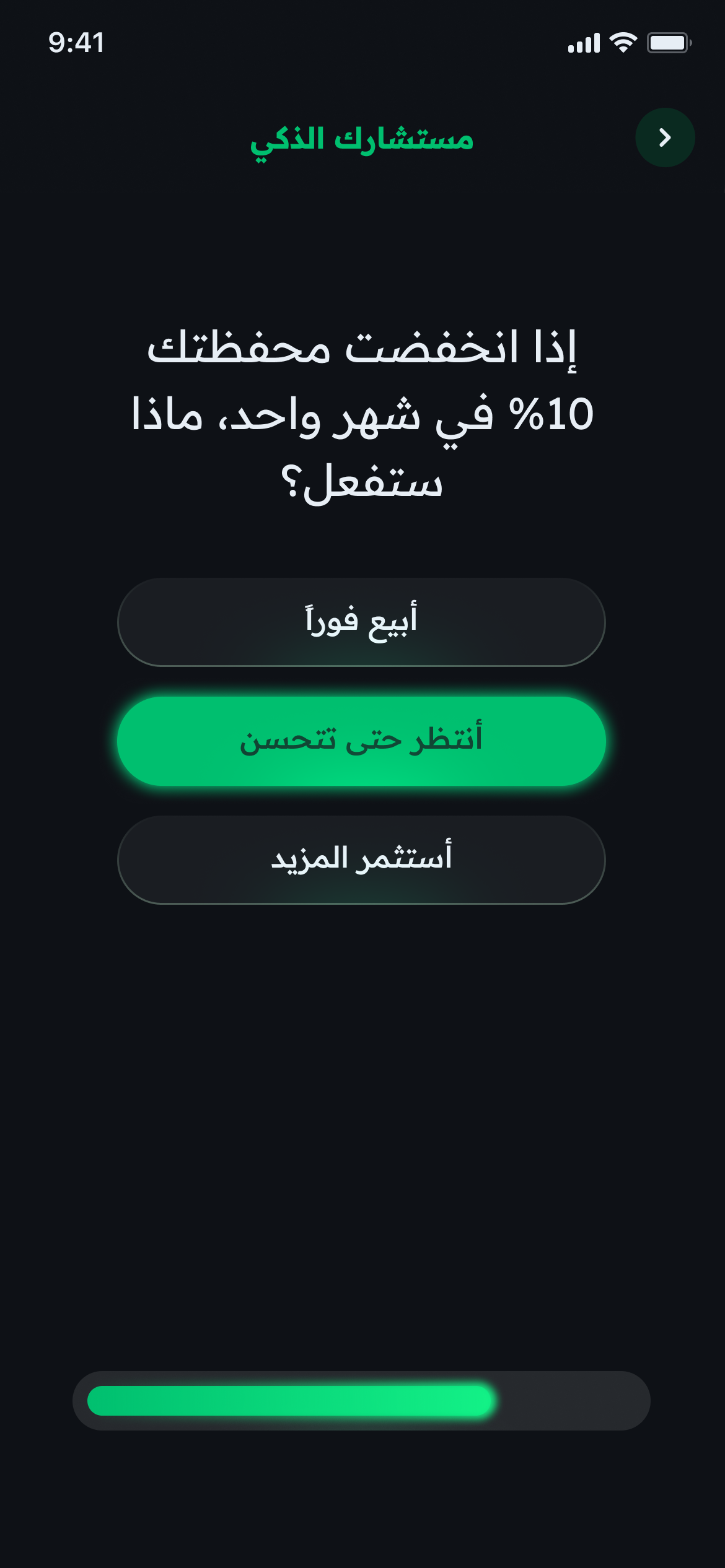
This flow was designed to help users understand their investment style in a way that feels personal and approachable. I wanted the experience to feel like a calm, thoughtful dialogue rather than a financial quiz. Each question uses simple, familiar language to explore risk tolerance without invoking complex terms. Both the bright and dark modes were designed to serve the same emotional goal: clarity without distraction. The dark mode creates focus and a sense of stability, while the bright mode brings warmth and openness for users who prefer a lighter, more optimistic tone. The final emblem animation closes the sequence with quiet reassurance, rewarding completion and building trust. My goal was to replace uncertainty with self-awareness helping users feel grounded and confident before seeing any investment options.
Portfolio Recommendation
Empowerment through transparency

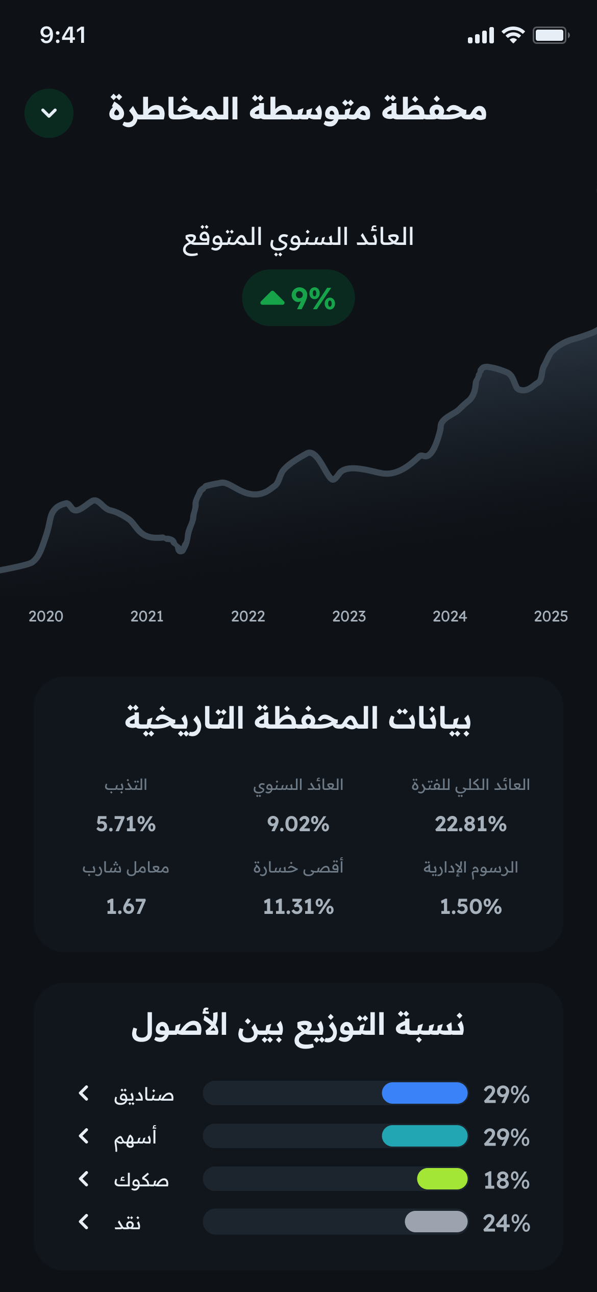
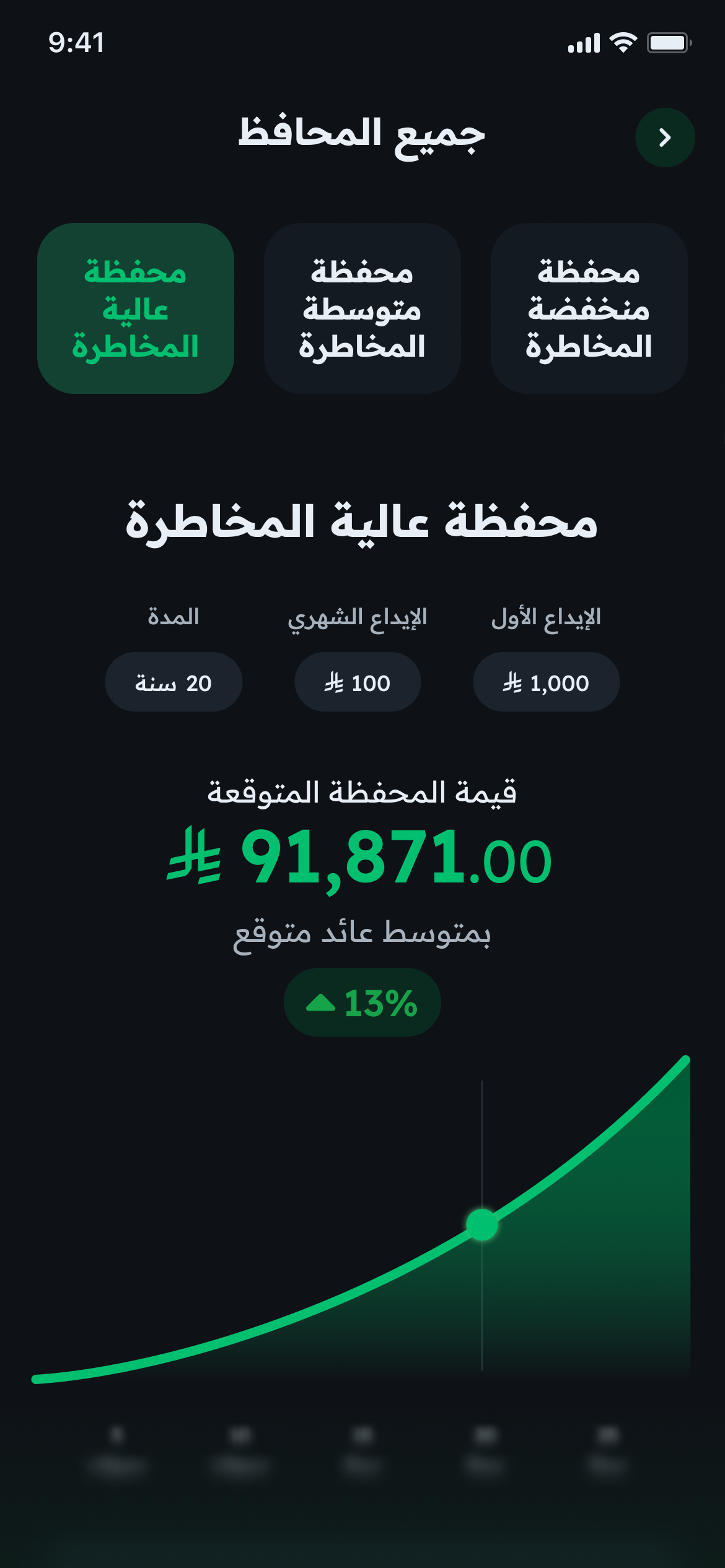
This flow empowers users to explore and choose a portfolio that feels right for them, visually and financially. I wanted to present investment decisions as guided exploration rather than persuasion. The experience begins with a personalized recommendation, then invites users to compare all available portfolios, adjust investment amounts, and instantly see projected outcomes. Designing for both bright and dark modes ensured that the sense of clarity and control is consistent across contexts, the dark mode emphasizes focus and professionalism, while the bright mode conveys openness and transparency. Each chart, number, and label was tuned to feel steady and trustworthy, with green tones signaling healthy growth rather than risk. My goal was to make investment selection feel effortless, informed, and fully under the user’s control.
Creating the Portfolio
Confidence through accomplishment


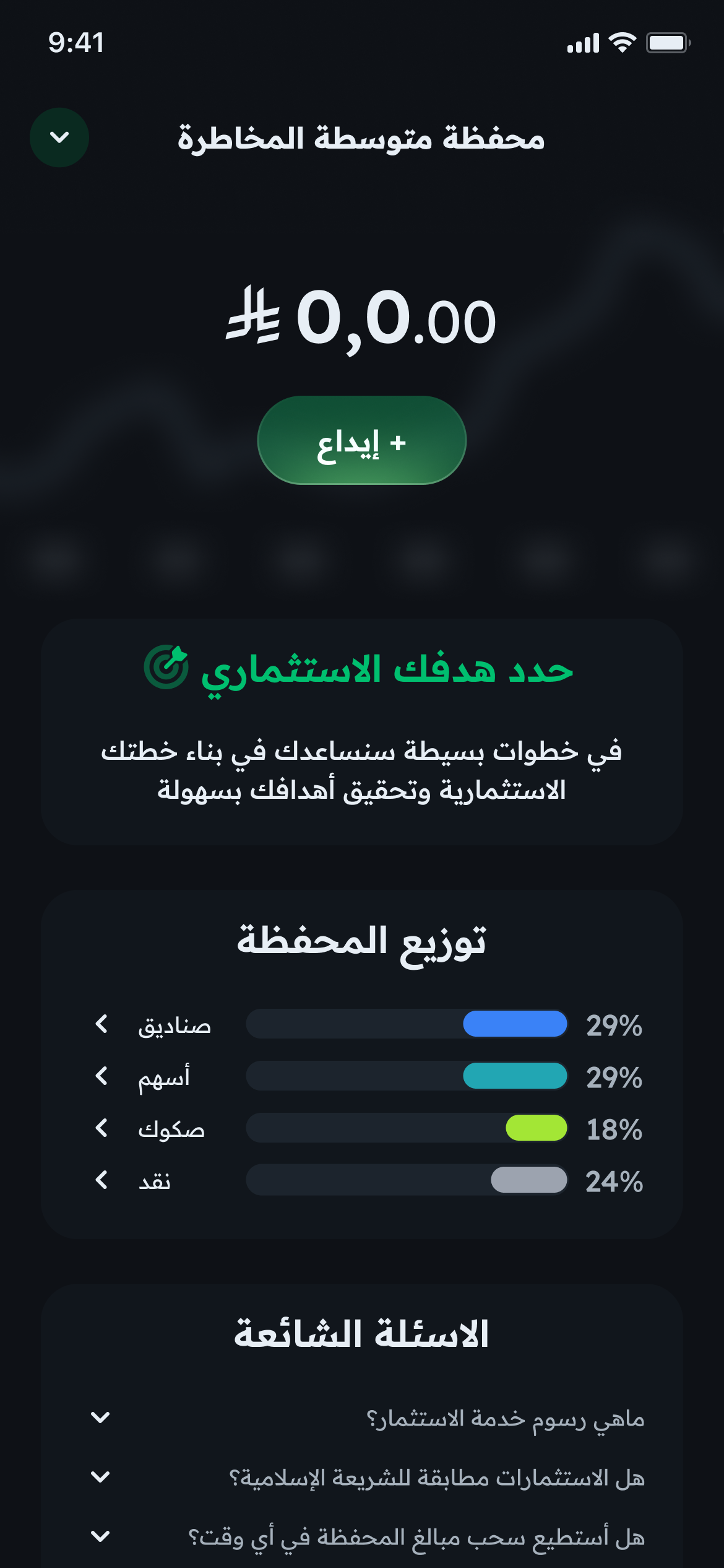
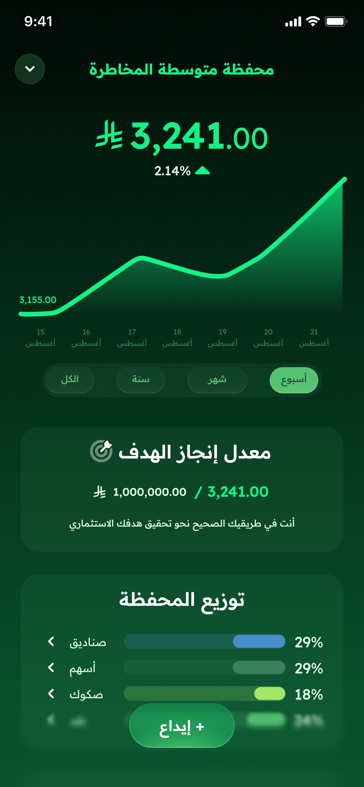
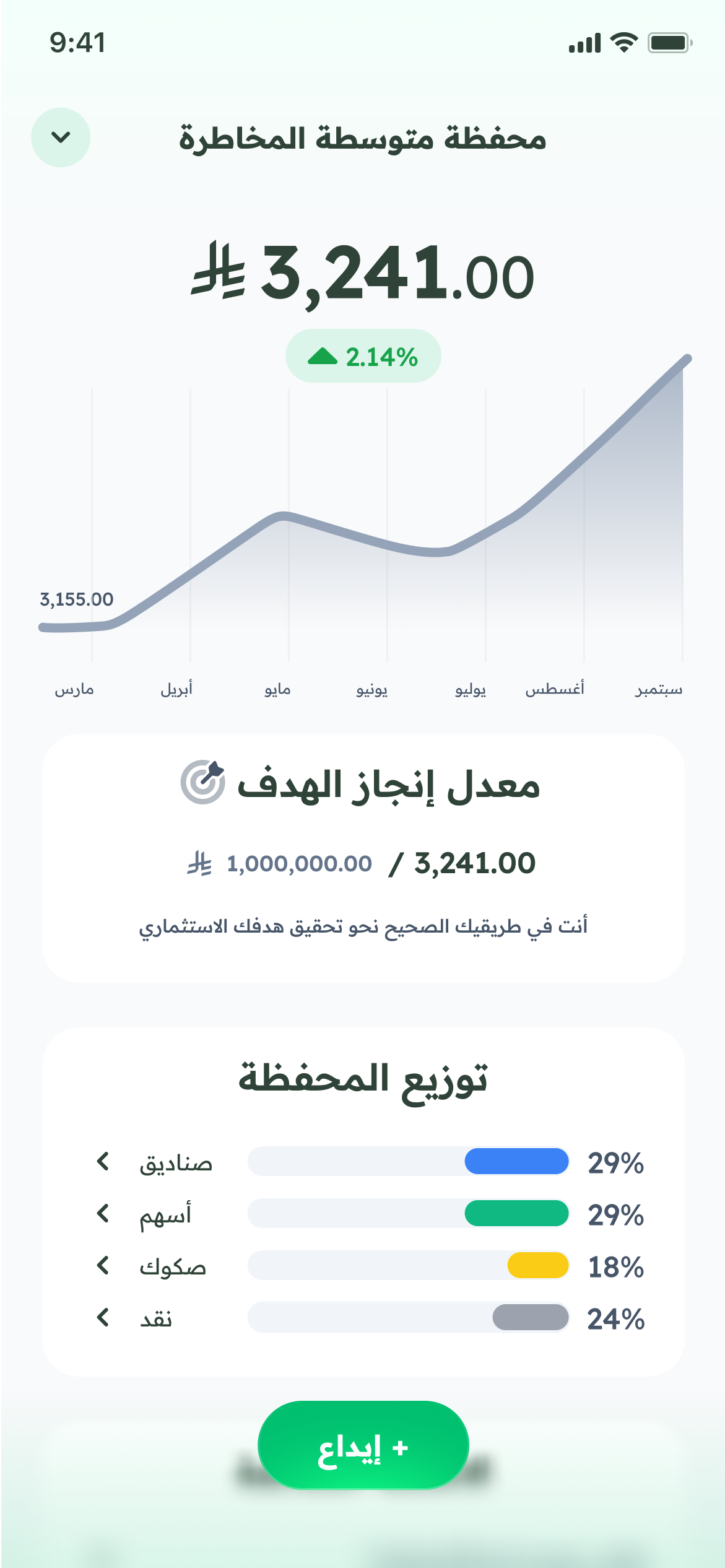
This flow marks the moment when users turn insight into action by creating their own investment portfolio. My goal was to make this step feel both empowering and reassuring, a confirmation that the user has made a well-informed choice. After reviewing portfolio details and projected growth, users can easily initiate creation and immediately see a confirmation message that feels celebratory yet calm. The emblem animation signals success without exaggeration, maintaining the app’s professional tone. I designed the summary view to feel like a personalized dashboard: clear allocation visuals, historical data, and quick access to common questions. This helps users transition smoothly from setup to management, reinforcing a sense of ownership and confidence in their financial path.
Setting a Goal and Building an Investment Plan
Motivation grounded in clarity
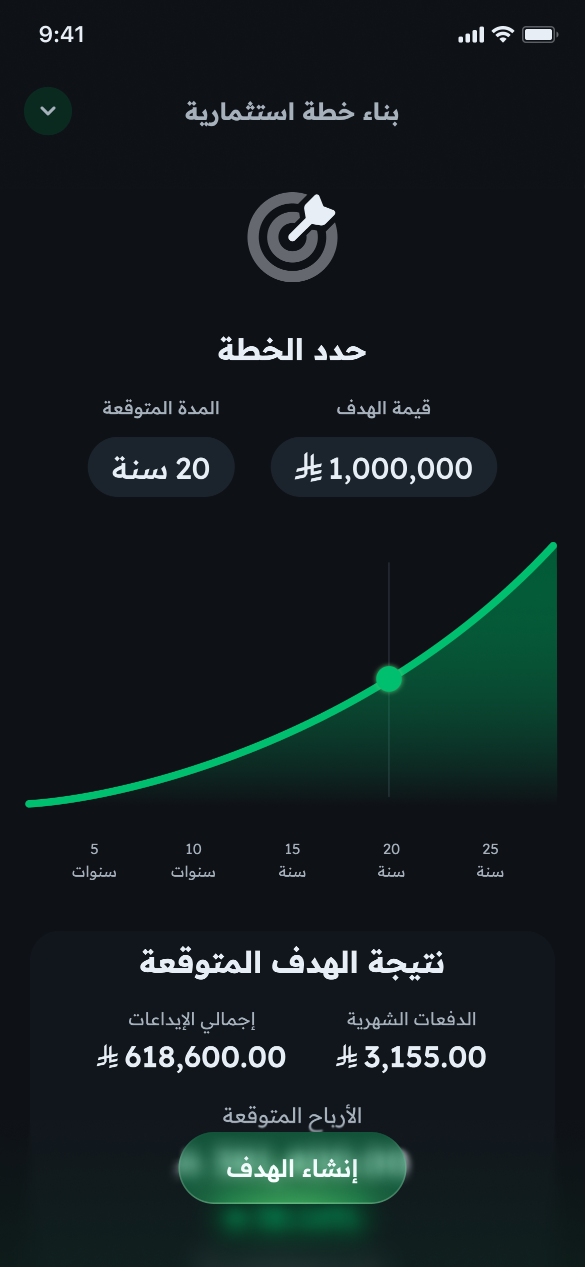
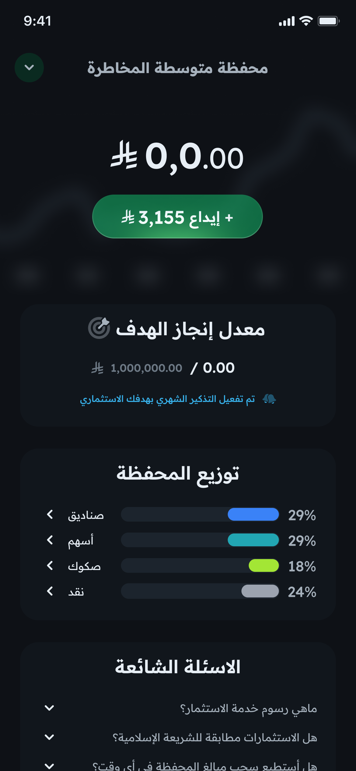
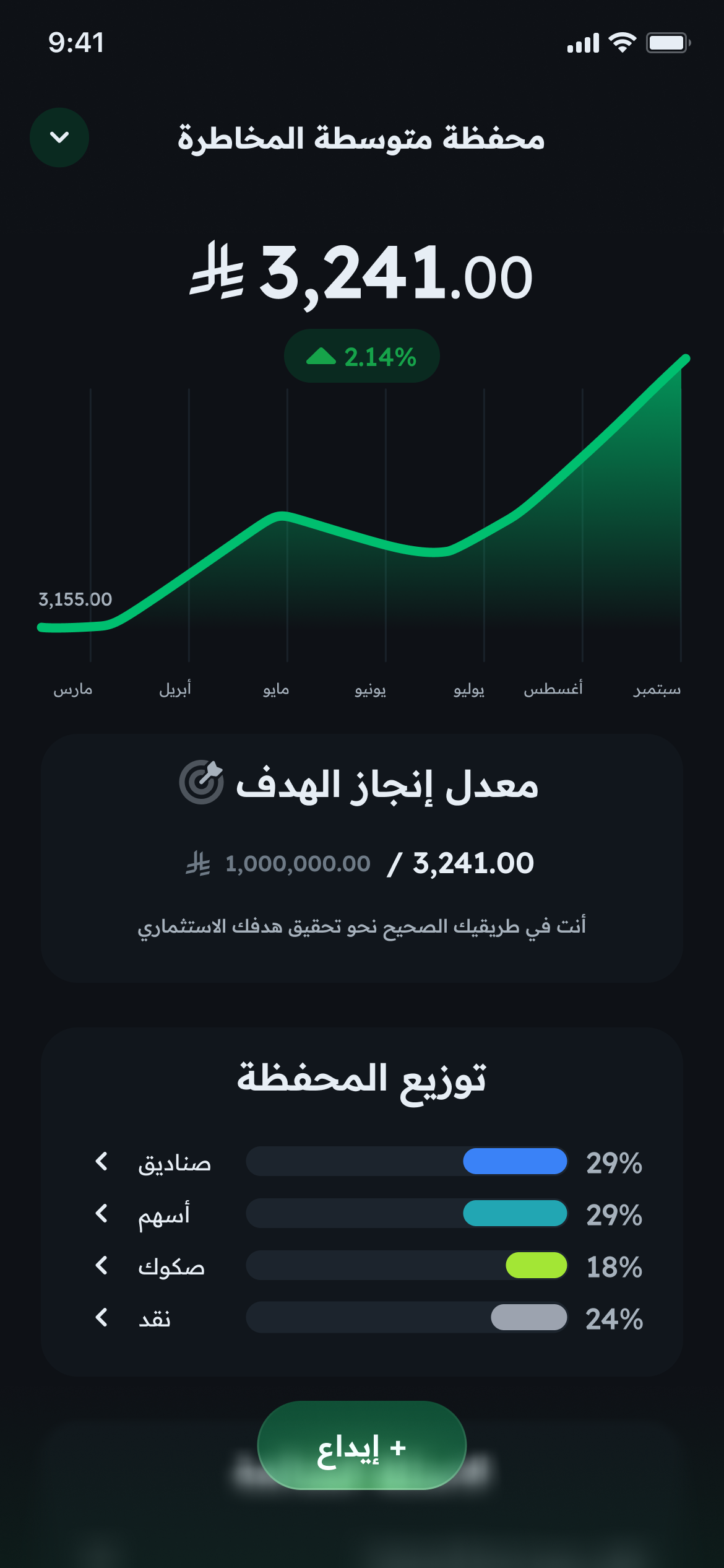
This flow turns intention into a concrete path. After choosing a portfolio, users can define their investment goal - how much they want to reach and over what period - and immediately see projections for returns and progress. I designed this flow to bridge logic with inspiration: it helps users visualize what disciplined investing can achieve without ever feeling abstract or overwhelming. Every screen communicates progress through visual cues like growth curves, completion percentages, and concise summaries. The interface avoids complexity by presenting numbers in an encouraging, easy-to-digest format. The confirmation state adds a quiet sense of achievement, while the “first deposit” view introduces users to their ongoing journey. My goal was to make planning feel rewarding and motivational, helping users leave the experience with a clear sense of direction and confidence in their long-term goals.
Testing & Outcomes
Validation through real feedback

Before finalizing the experience, I conducted moderated usability tests with a small group of early users representing different investment familiarity levels, from first-time investors to those already using financial apps. The sessions focused on clarity, flow comprehension, and emotional comfort across key journeys: onboarding, portfolio selection, and goal setting.
The insights were both confirming and eye-opening:
- Comprehension: 4 out of 5 participants understood the purpose of each step without external explanation.
- Trust perception: 80% described the interface as “clear,” “professional,” or “reassuring.”
- Guidance clarity: All participants completed the risk profiling flow without confusion or backtracking.
- Confidence metric: 3 out of 5 participants said they felt more confident investing after completing the flow, even without seeing final returns.
However, one recurring piece of feedback stood out: users felt that the overuse of green in the early version made it harder to focus and diluted the sense of hierarchy. I revisited the visual system and refined it by introducing both bright and dark modes, each using green more strategically to guide attention rather than dominate it. This balance enhanced contrast, improved readability, and gave the experience a calmer, more professional tone.
Overall, the testing validated the experience as approachable and emotionally balanced. Smart Advisory successfully turned what users often described as “an intimidating process” into a guided, trustworthy journey that builds confidence step by step.
A Reflection
Growth through restraint
This project taught me the importance of balance not just in portfolios, but in design itself. Creating Smart Advisory pushed me to think beyond usability and into the psychology of trust: how tone, motion, and color can shape emotional comfort as much as functionality does. Iterating through usability feedback, especially refining my visual system to use color with intention, reminded me that good design isn’t about decoration it’s about precision, empathy, and restraint.
By the end, I realized that designing for finance isn’t about teaching users how to invest; it’s about giving them the confidence to believe they can.
© 2025 All rights reserved
Home
Visual Snapshots
Contact
Explore the Future of Investing, Smart Advisory

The Challenge
Bringing Guidance and Trust to Investing
When I first started exploring the investing landscape, I noticed how intimidating most digital experiences felt. Apps were either overloaded with financial jargon or too eager to upsell, leaving users anxious rather than informed. I wanted to design an experience that helps people invest confidently, one that feels intelligent yet approachable, trustworthy yet empowering.
That vision became Smart Advisory, a Robo-Advisory experience designed to make smart investing feel effortless.
Competitive Insights
What I Learned From the Field

To ground my approach, I benchmarked three successful financial apps: Malaa, Drahim, and Revolut.
Across these products, I discovered patterns that shaped the foundation of Smart Advisory: smooth onboarding, simple risk profiling, and concise summaries that reduced cognitive load.
But I also noticed recurring friction points: confusing terminology, pushy upselling, and unclear exit paths. These observations guided my focus on clarity, calm guidance, and giving users full control over their investment journey.
Jobs To Be Done & Design Principles
The Real Jobs Our Users Are Hiring Us For


Through user research and scenario mapping, I distilled three core motivations behind why people turn to a robo-advisor:
- “I’m new to investing. I want simple, confident guidance.”
- “I don’t have time. I need quick, trustworthy recommendations.”
- “I’m cautious with risk. I want transparency and control.”
These became the foundation for my guiding principles:
- Subtle Intelligence (advice that helps without intruding)
- Trust by Design (transparency through tone, data, and behavior)
- Effortless Flow (familiar, low-friction interactions)
User Flow Overview
A Journey From Curiosity to Confidence

The user journey in Smart Advisory was designed to feel natural, structured, and emotionally grounded, guiding users from initial curiosity about investing to the confidence of building and managing their own plans. Each flow builds on the previous one, gradually increasing the user’s sense of understanding, trust, and control.
An Icon that Tells a Story
A Symbol Rooted in Growth, Trust, and Culture
I wanted Smart Advisory to have a visual identity that reflects both intelligence and local culture.
At its heart, the emblem’s negative space forms a subtle sparkle, a nod to guidance and AI insight. Surrounding it, leaf-like shapes represent growth, prosperity, and financial wellness.
The geometry draws inspiration from Islamic art, balancing modernity with cultural familiarity. The result is a symbol that feels human and trustworthy, just like the experience it represents.
Risk Profiling
Curiosity turning into calm confidence


This flow was designed to help users understand their investment style in a way that feels personal and approachable. I wanted the experience to feel like a calm, thoughtful dialogue rather than a financial quiz. Each question uses simple, familiar language to explore risk tolerance without invoking complex terms. Both the bright and dark modes were designed to serve the same emotional goal: clarity without distraction. The dark mode creates focus and a sense of stability, while the bright mode brings warmth and openness for users who prefer a lighter, more optimistic tone. The final emblem animation closes the sequence with quiet reassurance, rewarding completion and building trust. My goal was to replace uncertainty with self-awareness helping users feel grounded and confident before seeing any investment options.
Portfolio Recommendation
Empowerment through transparency


This flow empowers users to explore and choose a portfolio that feels right for them, visually and financially. I wanted to present investment decisions as guided exploration rather than persuasion. The experience begins with a personalized recommendation, then invites users to compare all available portfolios, adjust investment amounts, and instantly see projected outcomes. Designing for both bright and dark modes ensured that the sense of clarity and control is consistent across contexts, the dark mode emphasizes focus and professionalism, while the bright mode conveys openness and transparency. Each chart, number, and label was tuned to feel steady and trustworthy, with green tones signaling healthy growth rather than risk. My goal was to make investment selection feel effortless, informed, and fully under the user’s control.
Creating the Portfolio
Confidence through accomplishment


This flow marks the moment when users turn insight into action by creating their own investment portfolio. My goal was to make this step feel both empowering and reassuring, a confirmation that the user has made a well-informed choice. After reviewing portfolio details and projected growth, users can easily initiate creation and immediately see a confirmation message that feels celebratory yet calm. The emblem animation signals success without exaggeration, maintaining the app’s professional tone. I designed the summary view to feel like a personalized dashboard: clear allocation visuals, historical data, and quick access to common questions. This helps users transition smoothly from setup to management, reinforcing a sense of ownership and confidence in their financial path.
Setting a Goal and Building an Investment Plan
Motivation grounded in clarity


This flow turns intention into a concrete path. After choosing a portfolio, users can define their investment goal - how much they want to reach and over what period - and immediately see projections for returns and progress. I designed this flow to bridge logic with inspiration: it helps users visualize what disciplined investing can achieve without ever feeling abstract or overwhelming. Every screen communicates progress through visual cues like growth curves, completion percentages, and concise summaries. The interface avoids complexity by presenting numbers in an encouraging, easy-to-digest format. The confirmation state adds a quiet sense of achievement, while the “first deposit” view introduces users to their ongoing journey. My goal was to make planning feel rewarding and motivational, helping users leave the experience with a clear sense of direction and confidence in their long-term goals.
Testing & Outcomes
Validation through real feedback


Before finalizing the experience, I conducted moderated usability tests with a small group of early users representing different investment familiarity levels, from first-time investors to those already using financial apps. The sessions focused on clarity, flow comprehension, and emotional comfort across key journeys: onboarding, portfolio selection, and goal setting.
The insights were both confirming and eye-opening:
- Comprehension: 4 out of 5 participants understood the purpose of each step without external explanation.
- Trust perception: 80% described the interface as “clear,” “professional,” or “reassuring.”
- Guidance clarity: All participants completed the risk profiling flow without confusion or backtracking.
- Confidence metric: 3 out of 5 participants said they felt more confident investing after completing the flow, even without seeing final returns.
However, one recurring piece of feedback stood out: users felt that the overuse of green in the early version made it harder to focus and diluted the sense of hierarchy. I revisited the visual system and refined it by introducing both bright and dark modes, each using green more strategically to guide attention rather than dominate it. This balance enhanced contrast, improved readability, and gave the experience a calmer, more professional tone.
Overall, the testing validated the experience as approachable and emotionally balanced. Smart Advisory successfully turned what users often described as “an intimidating process” into a guided, trustworthy journey that builds confidence step by step.
A Reflection
Growth through restraint
This project taught me the importance of balance not just in portfolios, but in design itself. Creating Smart Advisory pushed me to think beyond usability and into the psychology of trust: how tone, motion, and color can shape emotional comfort as much as functionality does. Iterating through usability feedback, especially refining my visual system to use color with intention, reminded me that good design isn’t about decoration it’s about precision, empathy, and restraint.
By the end, I realized that designing for finance isn’t about teaching users how to invest; it’s about giving them the confidence to believe they can.
Home
Visual Snapshots
Contact
© 2025 All rights reserved
Home
Visual Snapshots
Contact
Explore the Future of Investing, Smart Advisory

The Challenge
Bringing Guidance and Trust to Investing
When I first started exploring the investing landscape, I noticed how intimidating most digital experiences felt. Apps were either overloaded with financial jargon or too eager to upsell, leaving users anxious rather than informed. I wanted to design an experience that helps people invest confidently, one that feels intelligent yet approachable, trustworthy yet empowering.
That vision became Smart Advisory, a Robo-Advisory experience designed to make smart investing feel effortless.
Competitive Insights
What I Learned From the Field

To ground my approach, I benchmarked three successful financial apps: Malaa, Drahim, and Revolut.
Across these products, I discovered patterns that shaped the foundation of Smart Advisory: smooth onboarding, simple risk profiling, and concise summaries that reduced cognitive load.
But I also noticed recurring friction points: confusing terminology, pushy upselling, and unclear exit paths. These observations guided my focus on clarity, calm guidance, and giving users full control over their investment journey.
Jobs To Be Done & Design Principles
The Real Jobs Our Users Are Hiring Us For


Through user research and scenario mapping, I distilled three core motivations behind why people turn to a robo-advisor:
- “I’m new to investing. I want simple, confident guidance.”
- “I don’t have time. I need quick, trustworthy recommendations.”
- “I’m cautious with risk. I want transparency and control.”
These became the foundation for my guiding principles:
- Subtle Intelligence (advice that helps without intruding)
- Trust by Design (transparency through tone, data, and behavior)
- Effortless Flow (familiar, low-friction interactions)
User Flow Overview
A Journey From Curiosity to Confidence

The user journey in Smart Advisory was designed to feel natural, structured, and emotionally grounded, guiding users from initial curiosity about investing to the confidence of building and managing their own plans. Each flow builds on the previous one, gradually increasing the user’s sense of understanding, trust, and control.
An Icon that Tells a Story
A Symbol Rooted in Growth, Trust, and Culture
I wanted Smart Advisory to have a visual identity that reflects both intelligence and local culture.
At its heart, the emblem’s negative space forms a subtle sparkle, a nod to guidance and AI insight. Surrounding it, leaf-like shapes represent growth, prosperity, and financial wellness.
The geometry draws inspiration from Islamic art, balancing modernity with cultural familiarity. The result is a symbol that feels human and trustworthy, just like the experience it represents.
Risk Profiling
Curiosity turning into calm confidence


This flow was designed to help users understand their investment style in a way that feels personal and approachable. I wanted the experience to feel like a calm, thoughtful dialogue rather than a financial quiz. Each question uses simple, familiar language to explore risk tolerance without invoking complex terms. Both the bright and dark modes were designed to serve the same emotional goal: clarity without distraction. The dark mode creates focus and a sense of stability, while the bright mode brings warmth and openness for users who prefer a lighter, more optimistic tone. The final emblem animation closes the sequence with quiet reassurance, rewarding completion and building trust. My goal was to replace uncertainty with self-awareness helping users feel grounded and confident before seeing any investment options.
Portfolio Recommendation
Empowerment through transparency


This flow empowers users to explore and choose a portfolio that feels right for them, visually and financially. I wanted to present investment decisions as guided exploration rather than persuasion. The experience begins with a personalized recommendation, then invites users to compare all available portfolios, adjust investment amounts, and instantly see projected outcomes. Designing for both bright and dark modes ensured that the sense of clarity and control is consistent across contexts, the dark mode emphasizes focus and professionalism, while the bright mode conveys openness and transparency. Each chart, number, and label was tuned to feel steady and trustworthy, with green tones signaling healthy growth rather than risk. My goal was to make investment selection feel effortless, informed, and fully under the user’s control.
Creating the Portfolio
Confidence through accomplishment


This flow marks the moment when users turn insight into action by creating their own investment portfolio. My goal was to make this step feel both empowering and reassuring, a confirmation that the user has made a well-informed choice. After reviewing portfolio details and projected growth, users can easily initiate creation and immediately see a confirmation message that feels celebratory yet calm. The emblem animation signals success without exaggeration, maintaining the app’s professional tone. I designed the summary view to feel like a personalized dashboard: clear allocation visuals, historical data, and quick access to common questions. This helps users transition smoothly from setup to management, reinforcing a sense of ownership and confidence in their financial path.
Setting a Goal and Building an Investment Plan
Motivation grounded in clarity


This flow turns intention into a concrete path. After choosing a portfolio, users can define their investment goal - how much they want to reach and over what period - and immediately see projections for returns and progress. I designed this flow to bridge logic with inspiration: it helps users visualize what disciplined investing can achieve without ever feeling abstract or overwhelming. Every screen communicates progress through visual cues like growth curves, completion percentages, and concise summaries. The interface avoids complexity by presenting numbers in an encouraging, easy-to-digest format. The confirmation state adds a quiet sense of achievement, while the “first deposit” view introduces users to their ongoing journey. My goal was to make planning feel rewarding and motivational, helping users leave the experience with a clear sense of direction and confidence in their long-term goals.
Testing & Outcomes
Validation through real feedback


Before finalizing the experience, I conducted moderated usability tests with a small group of early users representing different investment familiarity levels, from first-time investors to those already using financial apps. The sessions focused on clarity, flow comprehension, and emotional comfort across key journeys: onboarding, portfolio selection, and goal setting.
The insights were both confirming and eye-opening:
- Comprehension: 4 out of 5 participants understood the purpose of each step without external explanation.
- Trust perception: 80% described the interface as “clear,” “professional,” or “reassuring.”
- Guidance clarity: All participants completed the risk profiling flow without confusion or backtracking.
- Confidence metric: 3 out of 5 participants said they felt more confident investing after completing the flow, even without seeing final returns.
However, one recurring piece of feedback stood out: users felt that the overuse of green in the early version made it harder to focus and diluted the sense of hierarchy. I revisited the visual system and refined it by introducing both bright and dark modes, each using green more strategically to guide attention rather than dominate it. This balance enhanced contrast, improved readability, and gave the experience a calmer, more professional tone.
Overall, the testing validated the experience as approachable and emotionally balanced. Smart Advisory successfully turned what users often described as “an intimidating process” into a guided, trustworthy journey that builds confidence step by step.
A Reflection
Growth through restraint
This project taught me the importance of balance not just in portfolios, but in design itself. Creating Smart Advisory pushed me to think beyond usability and into the psychology of trust: how tone, motion, and color can shape emotional comfort as much as functionality does. Iterating through usability feedback, especially refining my visual system to use color with intention, reminded me that good design isn’t about decoration it’s about precision, empathy, and restraint.
By the end, I realized that designing for finance isn’t about teaching users how to invest; it’s about giving them the confidence to believe they can.
Home
Visual Snapshots
Contact
© 2025 All rights reserved